Thursday, November 8, 2018

Lesson 6 - Traveler's Notebooks

This project introduces a much smaller format of scrapbooking, the traveler’s notebook.  I’m using the standard size traveler’s notebook that accompanied the Felicity Jane kit for this class, it measures 8 1/4″ x 4 1/4″, so I make my layout on two 8″x4″ pieces of paper and then tape them into the book.  I find it much easier to create my layout outside of the book, then to add it in.

It’s very important to keep traveler’s notebook layouts as flat as possible otherwise your notebook will become very thick and the spine could break, been there done that!  This smaller format is a great way to use up scraps of paper and leftover embellishments as well!

Here is the project:


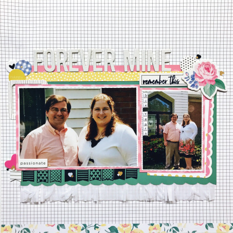
On this layout, notice I only have one layer behind this photo and my embellishments aren’t overly clustered either.  Due to the smaller size, this format doesn’t really need a lot of embellishment.  Feel free to keep these super simple!


The fringe is a great choice here because it adds texture without bulk. The puffy stickers do add a little dimension, but they have some give when you close the notebook, so they don’t stand out too much.  Notice the large amount of “white space” (empty space) on this page.  This is intended to be a notebook that you flip through, so keeping it simple is usually best.


Traveler’s notebooks are also great for pictures that need a lot of journaling, you can decorate one side with your photo and embellishment and then fill the other side with your story.

Here is the layout in action:


For more layout ideas for beginner scrapbookers, join me on Youtube with this playlist of easy-to-scraplift layouts:

Lesson 5 - Pocket Pages

This project introduces pocket pages, another style of scrapbooking that allows you to include a lot of photos!  In this page, I show you how to tell a story, using the order you put your photos in the pockets. This is a great option for larger events, like holidays or birthdays.  Be sure to leave some space for journaling as well!

The key with pocket pages is to limit 3D embellishments (like chipboard) to the 4×6 pockets and keep your 3x4s flat, so they will fit in the pockets easier.  The 4×6 pockets tend to be allow more space, while 3×4 pockets tend to be snug.

Here’s the project:


The fringe in this kit was quite flat, but added a fun texture to the page, so I layered it onto the title card and then used both the large and small alphabets for the title.  By keeping this card simple, your attention is immediately drawn to the bright and colorful photos.


I cut this tag from a scrap and layered flat ephemera pieces around it for a decorative insert, that also has the month and year.  Adding these decorative journaling cards keeps these pages fun and interesting to make as well as quick!


I had a lot of journaling to do on this page, so I paired a 3×4″ photo with a journaling card in a 4×6″ spot.  This is a great way to break up the heavy text on that card, by surrounding it with photos.

Here is the layout in action:


Lesson 4 - Creating Movement

In this project, I’m focusing on creating the appearance of movement on the layout.  By placing my clusters of embellishments and title in a diagonal flow from one side to the other, it guides the eye through the layout.  This ensures that the small details are not overlooked and that the photo commands the focus.  Regardless if you start looking at the top or the bottom of the layout, the flow of the embellishments will lead you to the photo.

This project builds on the previous lessons by taking those techniques to another level.  For example, I’ve again added the fringe for texture, but taken it up a notch, adding two layers of the fringe under a fussy cut scalloped border.  I’ve also fussy cut large floral clusters, including some detailed sprigs on the sides.  Can you see how taking those techniques a step further creates a more sophisticated look?

Here is the project:


As you can see, I fussy cut these florals very close to their edges, but the sprigs I left a little border around the narrowest parts.  This allows the sprigs to have some structure and keeps them from falling apart.  This small cluster here on the top right is very simple compared to the one at the bottom.  I wanted to add detail here, but not draw too much attention away from the title and journaling.


By using three different sizes and styles of words in my title, it gives a more interesting look, that draws your eye from the top to the bottom of the layout.  I’ve kept my journaling short and to the point because it’s displayed on top of the layout.  I prefer to put longer journaling into a hidden area, like on a tag tucked behind a photo.


Just as before, the small sequins are sprinkled all over the page to give that finishing detail that makes the layout feel polished.

Here is the layout in action:


Lesson 3 - Adding Texture & Dimension

In this project, I’m encouraging you to add in texture and create the appearance of dimension on your layout.  We will bring in new products (crepe paper or fringe) and introduce new techniques, the “rule of three” and fussy cutting.

The “rule of three” refers to the idea that odd numbers are more interesting to our brains and draw our attention more than even numbers.  So, as it applies to scrapbooking, creating three areas of interest on your layout will appeal to your own mind as well as others’.  In this layout, I’ve created three embellishment clusters in different areas of the page to draw your eye to all of the details, instead of just one.

Fussy cutting refers to the detail work of cutting out small, detailed things, like the scallop at the bottom of the cardstock.  This technique is usually done with smaller scissors that allow you better access to the nooks and crannies of the piece you’re cutting.

Here is our project:


In this embellishment cluster, I’ve even stuck to the “rule of three” by adding three larger embellishments to the cluster.  Don’t forget to add those tiny details like sequins to give the layout a finished, polished look!


In order to add the appearance of depth, layer embellishments and papers on top of each other. The more layers, the greater perception of depth that you’ve created.  Similarly, adding thicker pieces like chipboard, acrylics, and wood veneer can have this same effect.


Playing with textures is my favorite part of scrapbooking!  In this layout, I’ve introduced crepe paper.  While this is still a type of paper, the fringed look gives it an interesting look and feel.  Texture refers to the impression on a surface.  My desk top has a smooth texture, while my dog has a fluffy texture.  Adding items that have different textures can make a simple layout much more interesting!

Here’s the layout in action:

Begin Lesson FOUR

Lesson 2 - Multiple Photos & Grid Design

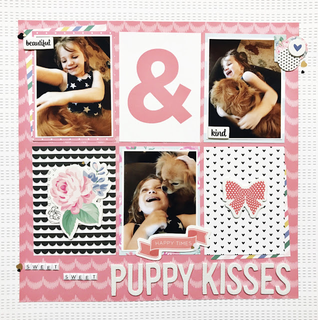
 A grid design is the simplest way to add multiple photos onto a layout.  By mixing both photos and journaling cards in 3″x 4″ sizes, I have created areas for embellishment as well.  I find that most people prefer to use at least two photos on a layout, because as scrapbookers, we tend to be avid photographers as well!  It can often be difficult to narrow down your choices to one photo, so I encourage you to try smaller sized photos.  This will allow you to take full advantage of the space on your page.

This is also a great opportunity to use journaling cards if you do not make pocket pages.  Here, I’ve used seven journaling cards on one page!

Here is the second project:


Due to the number of busy patterns on this page, I kept my embellishing minimal.  I do not want my embellishments to compete with my photos, the photos are always the main focus.  In this case, adding just a few small embellishment clusters finishes this page without overwhelming it.


I used both my small and large alphabet stickers on this layout to emphasize part of the title.  The larger words are the main idea of the title and the smaller ones are simply adding interest.  Again, on this layout, I’ve added small groupings of sequins for detail.


I’ve also contained my grid inside of a border.  The purpose for this is to bring order to the grid.  Particularly when you a number of different colors and patterns on a page, adding a border can pull it all together and give it a more cohesive feel.  These grid design layouts do not have to be perfectly aligned, by adding the half of a journaling card on an angle behind two of the the objects, it breaks up the straight lines.  This creates some interest as well as a beginning and ending point as you look through the layout.

Watch this layout in action:


Lesson 1 - The Basics

To begin our class, let’s talk paper!  Paper is the foundation of scrapbooking (also called papercrafting) and there is an enormous variety of colors, textures, patterns, and sizes.  It can be overwhelming to walk into a craft store and see the racks and racks of paper!  This is why I recommend starting with a kit or collection, limiting your supplies will make it much easier for you to make decisions and your patterns are already coordinated with each other.

Keep in mind what kind of photos you want to scrap when choosing a kit or collection.  You do not have to use a “themed” collection, for example, a birthday collection to scrap birthday photos.  I find it much easier to use collections that are theme neutral, that can be used for a large variety of photos styles.

When you are choosing your patterned papers, be sure to focus on colors and designs that appeal to you.  If they don’t inspire you to create, they will just sit in your stash!  Also, be sure to get both bold and subtle patterns, large and small.  This combination of designs will make pattern mixing much easier.

Here is the first project we are creating together:


This layout illustrates how to mix a large print with a small print, using a border to to separate them on both the background as well as behind the photo, this prevents the clash of designs.  In choosing which two patterns to use, I kept in mind that the black and white hearts are a simple repeating pattern, so this paper does not attract your attention like the large floral paper does.  You will want one paper that is the “star of the show” and the other is a “supporting role” for your background.


Also, I will show you how to layer your embellishments to create the appearance of depth on your page.  By simply tucking some embellishments underneath others, it creates a cluster.  By placing clusters in at least two different areas of the layout, you create areas of interest on the page.  This is an effective way of drawing the eye through the layout, so that all details are noticed.


Adding tiny details, like these sequins, gives the page a finished look.  Much like an artist adds the tiny strokes to a painting to define an image, scrapbookers can use small embellishments like sequins, enamel dots, or splattering to create a defined layout.

Watch this layout in action:

Begin Lesson TWO

Wednesday, November 7, 2018

Beginner Scrapbooking Supplies List

 Beginner Scrapbooking Supplies List

Tools 

Sharp Scissors 

Small Scissors (for fussy cutting – optional) 

Ruler (T-square preferred, but optional) 

Pencil & Pen 

Archival Ink in Black 

Adhesive (I prefer double sided tape and a glue) 


Scrapbooking Kit *I suggest using one collection for your papers, so they coordinate* 

6 double sided patterned papers – mix of large and small prints 2 double sided (or 4 single sided) color cardstock 

Trim – Ribbon (solid color) and crepe paper or fringe 

Sequins or enamel dots 

Die cut/ephemera pack 

Stamp set with words & pictures 

3x4 journaling cards (or cut down paper to 3x4 card size) 

A large and a small alphabet sticker set 

One other embellishment (like chipboard, stickers, etc)