Saturday, November 28, 2020

Sketch Inspiration | 9x12 Scrapbook Layout | Cocoa Vanilla Studio DT

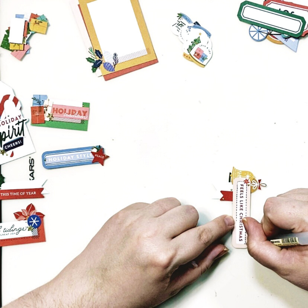
 *Originally written for Cocoa Vanilla Studio's blog*

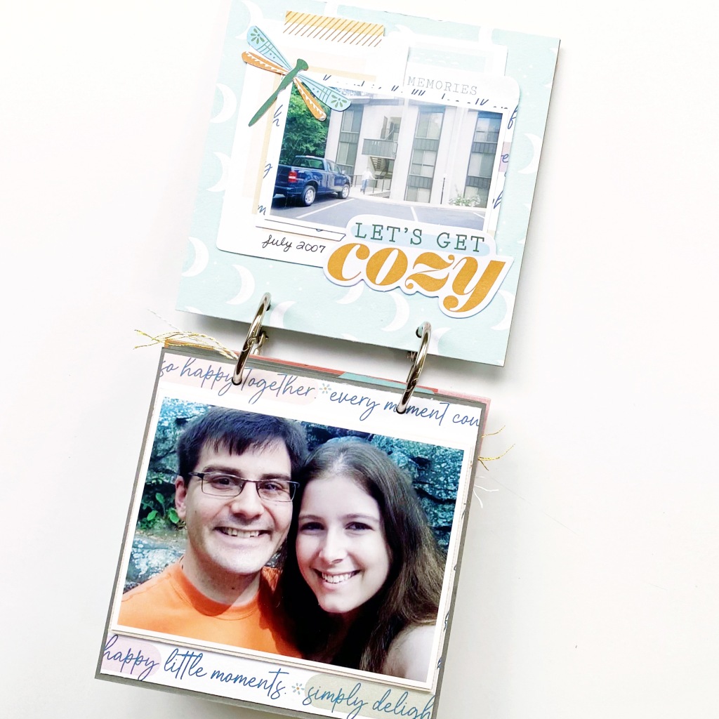
Hey y’all! Laura Alberts here today to share a darling 9×12 layout with you as well as a 12×12 sketch version of the same design! I sometimes create a sketch to plan out layouts that I want to get “just right” before taping everything down to the page. With this layout, I wanted to illustrate how to get a vertical and horizontal photo on the same page without trying to collage them together (which is generally my go-to method!). By creating two separate photo clusters backed with similar elements (i.e. a doily, florals, and banner), that are still connected by the title, I could tie them together despite the different orientations.

This image has an empty alt attribute; its file name is IMG_0027-1024x1024.jpg

This image has an empty alt attribute; its file name is Sketch-10.png

I used fussy cut florals behind each of the photos and included other design elements, such as flair badges and rainbows to coordinate the two sections. Now, because I was working on a smaller layout size than the 12×12 I’d sketched out, I did have to compromise on space for the title. So, by keeping it short and to the point, that helped it to fit in the limited space between the photo clusters.

This image has an empty alt attribute; its file name is IMG_9925-1024x1024.jpg

The butterflies, along with the Nuvo drop trails behind them, create a bit of movement on the page and guide your eye from one cluster to the other. Butterflies are my favorite icon and love that they are a consistent part of the Cocoa Vanilla Studio collections! I also love these tiny flowers that can be fussy cut from the floral patterned paper and used for sprinkling around my clusters. Those tiny details make such a big difference in the end!

This image has an empty alt attribute; its file name is IMG_9923-1024x1024.jpg

By layering my photo clusters onto a beautiful mixed media style patterned paper, rather than white card stock, it gives my overall layout a very soft feel to it. The borders on either side narrow the space for my clusters while giving me a linear element to contrast all of the whimsical, soft touches.

This image has an empty alt attribute; its file name is IMG_9924-1024x1024.jpg

I hope the sketch for this layout inspires you to look at your photo placement a little differently! It’s fun to see how you can change things up. If you’d like to see the Shine On layout come together, I have the entire process in the video below!


Thanks so much for stopping by!


Wednesday, November 25, 2020

Holiday DIY Embellishments | ACOT DT

 *Originally written for the Cherry Blog*

Today, we are preparing for holiday crafting with DIY embellishments perfect for journaling cards in your December Album, Christmas cards, or just holiday scrapping! These embellishments are all from Pinkfresh Studio’s Oh What Fun collection. These are great for personalizing your holiday crafts and projects! 


For these fun and easy add-ons, I used a mixture of labels, tags, banners, and fussy cut pieces of frames as bases and then just added a little (or a LOT) of die cuts, stickers, and icons from the patterned paper. Layering these pieces together with a sentiment makes for a quick and easy embellishment! 

A couple of tips that may help you with making these quickly are to keep the embellishing to one side of the base, use a pen to outline the sentiment if you think it’s getting lost, and layer like shapes together for a clustered look. 

Here are a few examples of how I used my DIY embellishments to add some flair and flavor to the very basic 3×4 journaling cards that came with this Pinkfresh Studio Oh What Fun collection! Love how these simple embellishments add a bit of WOW to these cards without a ton of effort. They could easily be added as a cluster on the bottom or corner of a photo, fun add-ons to a gift tag or card too! 

I hope these DIY Embellishments inspire you to look at your own supplies a bit differently and try personalizing your cards, tags, labels, etc. as well.  To see this project come together, check out the process video below! 


Thanks for stopping by!


Monday, November 16, 2020

"Good Time" | Daydream & More Than Words | Cocoa Vanilla Studio DT

 This image has an empty alt attribute; its file name is IMG_0026-1024x1024.jpg

Hey y’all! Laura Alberts here today to share a darling 9×12 layout with you that shows just how versatile Cocoa Vanilla Studio collections really are, they mix and match so beautifully together! This layout has both Daydream and More than Words meshed together. Using frames from both collections and backing them with cut-aparts and patterned paper to create the background, then layering my photo on top, makes for a sweet linear design that creates pockets perfect for embellishment clusters! Up in the top left, I added a rainbow and word phrase from Daydream, with a butterfly from More than Words!

This image has an empty alt attribute; its file name is IMG_9920-1024x1024.jpg 

I traced a border around all of the frames with my pen to give them a little extra depth and dimension (without adding bulk!) and created butterfly trails with Nuvo Drops to create the impression of movement. The stark black border is a paper from More than Words called Gossamer, and the back side of it is covered in more of these gorgeous butterflies! In the center cluster, the florals are a mix of the two collections, and I added small sequins for a bit of sparkle as well!

This image has an empty alt attribute; its file name is IMG_9919-1024x1024.jpg
This bottom cluster is my absolute favorite! It features florals from Daydream, a bit of sequins, and a tiny butterfly cut from the More than Words 6×8 paper pack. I love how this cluster bridges the gap between the photo and the title, adding just a nice pop of color where it’s needed most! By using a black and white version of the 4×6 photo, I’ve given myself plenty of opportunity to play with a variety of colors and the contrast between black and white! Love how it turned out!


This image has an empty alt attribute; its file name is IMG_9921-1024x1024.jpg
I hope the varied clusters on this layout inspires you to look at your embellishments a little differently! It’s fun to see how you can change things up. If you’d like to see the Good Times layout come together, I have the entire process in the video below!

Thanks for stopping by!


Sunday, November 1, 2020

November "Mini" ACOT Hop

For November’s hop, the A Cherry on Top Design Team decided to focus on ‘mini’ creations. My take on this prompt was to make a 4×4 inch chipboard mini album documenting one of the very few trips my husband and I have taken without kids. Our first trip together was to Hot Springs, AR in 2007 and we had a blast!

I used the beautiful Pinkfresh Studio Days of Splendor collection because the color scheme fit my photos beautifully. I created several interactive pages throughout the album including a mini-folio, flip-up, and a tag pocket for extra photos.

On this first page, I put a sweet photo of my husband and I and when flipped open it shows a hilarious selfie fail. This is probably one of the easiest interactive options for a mini album, just double the size of your photo mat in height and fold it in half, you triple your spaces for photos without adding a ton of bulk!

A slightly more complex option is this DIY folio. For this interactive piece, I used a piece of cardstock cut to double the width of the base page and then creased it at 1/4th of the page on each side to create a door. Then, I added a small strip of cardstock with a velcro sticker for a closure.

This sweet little tag with a flip open flap came with the collection and I added in three smaller photos of a silly moment on our hike. Love when these interactive pieces are done for you!

The last interactive page was a simple pocket for a few tags containing extra photos. For this one, I added an extra 1/2 inch to either side of the width of the base page and an extra 1/2 inch on the bottom. Then, creasing all three extra 1/2 inch pieces, taped them down to the base page, leaving the top open to hold tags.

To see these interactive pieces come together, check out the video below! Be sure to hop along to the next blog and see the rest of our Design Team’s take on the ‘mini’ challenge, as well as commenting on each one for a chance to win an ACOT gift card!

Thanks for stopping by!