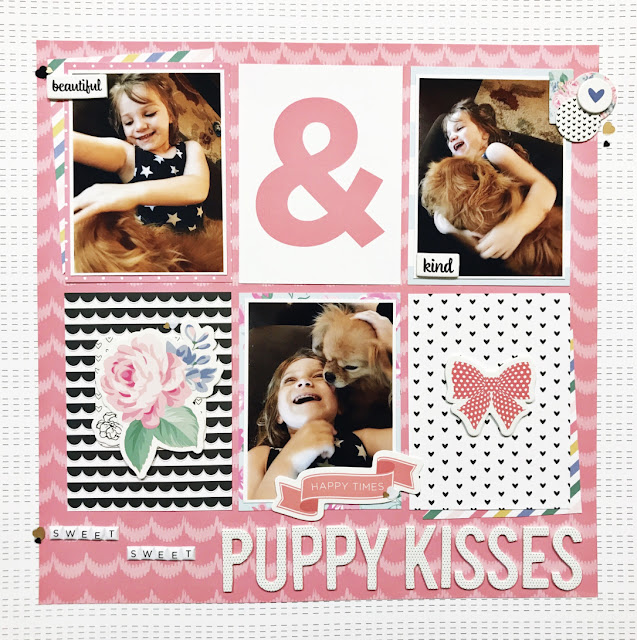
A grid design is the simplest way to add multiple photos onto a layout. By mixing both photos and journaling cards in 3″x 4″ sizes, I have created areas for embellishment as well. I find that most people prefer to use at least two photos on a layout, because as scrapbookers, we tend to be avid photographers as well! It can often be difficult to narrow down your choices to one photo, so I encourage you to try smaller sized photos. This will allow you to take full advantage of the space on your page.
This is also a great opportunity to use journaling cards if you do not make pocket pages. Here, I’ve used seven journaling cards on one page!
Here is the second project:
Due to the number of busy patterns on this page, I kept my embellishing minimal. I do not want my embellishments to compete with my photos, the photos are always the main focus. In this case, adding just a few small embellishment clusters finishes this page without overwhelming it.
I used both my small and large alphabet stickers on this layout to emphasize part of the title. The larger words are the main idea of the title and the smaller ones are simply adding interest. Again, on this layout, I’ve added small groupings of sequins for detail.
I’ve also contained my grid inside of a border. The purpose for this is to bring order to the grid. Particularly when you a number of different colors and patterns on a page, adding a border can pull it all together and give it a more cohesive feel. These grid design layouts do not have to be perfectly aligned, by adding the half of a journaling card on an angle behind two of the the objects, it breaks up the straight lines. This creates some interest as well as a beginning and ending point as you look through the layout.
Watch this layout in action:


No comments:
Post a Comment