Sunday, September 20, 2020

Pattern Paper Play | Cocoa Vanilla Studio DT

 *Originally written for Cocoa Vanilla Studio’s Blog*

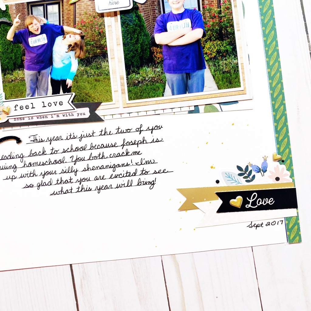
Hi y’all! Laura back again with a burst of color in this joyful layout of my darling girls playing together. I just adore their sweet friendship and have to celebrate it at every opportunity! Today’s theme is Throwback Thursday, so I reached into my stash for the very first Cocoa Vanilla collection I ever purchased, the stunning Bohemian Dream! This bold mix of pink, purple, and navy captured my heart from the very first time I saw it.

To start this layout, I backed a cut file from Redefined Kreative with the Abstract patterned paper, then layered it onto the Wild & Free Paper to make a big, bold patterned paper background. Building up from there, I used the remaining purple B-side of Abstract to mat my photos and then added lots of beautiful florals and word phrases around them.

To finish it off, I added some enamel shapes, gold Nuvo drops, gold ink splatter, and sequins from Spiegelmom Scraps that coordinated perfectly! These little details make such a huge difference on a layout and can take a simple page to superb in a flash! I had plenty to share about these two peas in a pod, so I wrote my journaling all around the outside of the mandala. This gave it a bit of an outline as well to distinguish the cut file from the background.

I hope this pattern paper filled layout inspires you to look at your papers a little differently! It’s fun to see how you can use up every little scrap. If you’d like to see the Play layout come together, I have the entire process in the video below!

Thanks for stopping by!


Sunday, September 13, 2020

5 Ways to Decorate Craft Letters | ACOT DT


*Originally written for A Cherry on Top*

Have you every seen the large, decorated letters often used in fancy décor? I love the look of them and the personalized touch they add to a room, so I tried five different ways to decorate them and I love them all! 

First, I prepped the letters altogether to keep it easy. I painted the sides and tops of each letter with a layer of white gesso, then a coat of white acrylic paint. The gesso helps seal the paper mache and keep it protected, while the acrylic paint is opaque enough to color the letters white. With the ‘A’, I simple added a coat of matte gel medium to the top of the letter and pressed it down on top of patterned paper with a “painted” look! This page came from Vicki Boutin’s pre-made mixed media pad. Next, I roughed up the edges when I cut it out to give it more texture and then sealed it with matte gel medium. 

For the ‘R’, I decided to go wild with a few packs of Prima flowers! I adore the look and texture these florals added to this letter. I painted the top of the ‘R’ with a layer of Prima’s 3D gel medium (needs to have a pretty heavy body gel medium to get a strong hold!) and then pushed the flowers into the gel, holding it firmly until I was sure it was secure. Starting with the large florals so that I was sure they had plenty of room, then filling in the openings with smaller and smaller florals. 

Up next was the ‘T’ and I thought it needed some bling! I painted the top of the letter with matte gel medium and then covered it liberally with Wow Glitter in gold! Now, this one is a project to set up and walk away from as it takes quite a while to dry, but when you come back and shake off the excess glitter, it’s stunning! You can seal in the glitter once it’s completely dry with hair spray. 

With the ‘S,’ I took on an ambitious idea to fill the letter with resin flowers! Using the Prima 3D gel medium again, I painted a thick layer onto the top of the letter ‘S’ and then stuck the flowers wherever they would fit, puzzling them together to fill in the entire space! This one might be my favorite because it looks amazing! 

Now, for the Y, I wanted to try something a bit different. I dug deep in my stash for some Jane Davenport tissue paper and using a thin layer of matte gel medium, affixed it to the top and sides of my letter. I added another layer of matte gel to seal it in and protect the tissue long-term. It looks like the design was drawn directly on to the letter! Such a cool effect! 

I hope these crafty ideas for decorating letters inspire you to give this project a try too! You can use your initials, spell a meaningful word, or even your kids’ names! To see this project come together, check out the process video below! 


Thanks for stopping by!


Tuesday, September 1, 2020

September 2020 ACOT Hop

This month’s theme is Fall/Autumn Vibes and because we don’t really have a substantial change in our weather here in Mississippi this time of year, I decided to scrap these new school clothes photos! That is an exciting part of the Fall season here!

I dived into Jen Hadfield’s gorgeous new fall line, Avenue, for this one, but stuck largely to the greens and blues to coordinate with my photos! I just had to fussy cut out those gorgeous floral ephemera to stand on their own without the white border.

For my title, I used an Amy Tangerine Thicker chipboard Thicker set and used paint pens to recolor the words to match the black detailing on the florals. This was such a fun way to modify my supplies to make them work for me!

In the center of my grid of photos, I popped this “love grows here” ephemera up on foam and tucked florals and a chipboard heart to keep the attention on the photos. I love the way these nestle perfectly inside the shapes of my photo subjects!

I love the way this layout turned out and I was strongly inspired by this fun sketch from Lottie Loves Paper while making this one! I love that this sketch isn’t just in black and white, that is much more helpful for my color loving brain.

To see this layout come together, check out the process video below:

Be sure to hop along to each member of the Design Team and the amazing Erica Creates is next!

Thanks for stopping by!